• Hi, If you cannot get into the site, be sure to Contact Us. Please be advised that the app is no longer in use!

New VS Old

Pierce

Administrator
Staff member
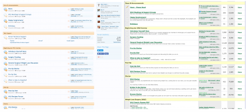
I have seen some comments about how the old site was better and easier to use. So I have taken screenshots side by side.

Front page / Home page when you click on the wlsurgery logo:
upload_2016-7-9_12-57-29.png

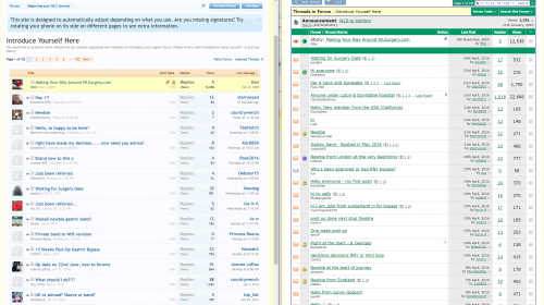
Then theres the forum view, I hav gone into introduce yourself:
upload_2016-7-9_12-59-2.png

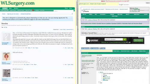
Viewing a thread:(https://www.wlsurgery.com/threads/newbie.160848/) It is actually a lot cleaner and a lot more content displayed on every page.
upload_2016-7-9_13-0-31.png

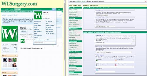
When you click on a username: (I have just added the "All posts" which I have renamed to "Find all posts", because that saves 2-3 clicks to find a new users content :) )
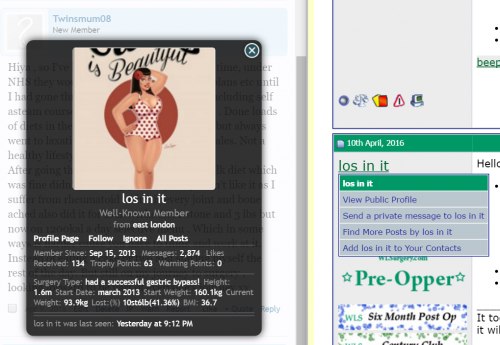
upload_2016-7-9_13-12-45.png

The user control panel:

upload_2016-7-9_13-15-24.png


Is there any other pages or elements that I am missing that you fondly remember using?

I know its new, and new takes time to get used to, no matter how similar it is.

I know I have work to do for badges, which this has reminded me and other small bits n pieces.

Pierce
 

Attachments

  • upload_2016-7-9_12-57-4.png
    upload_2016-7-9_12-57-4.png
    480.8 KB · Views: 1
I think most miss the app .. On the app it opened immediately and was very convenient .. I never did have the app so I have nothing to compare to ..
I use an iPad and just leave the page open all the time on my browser.. Then hit refresh ..
Mindy
Xxx
 
Hi Pierce

Yes, I think it is the app that most people miss. I didn't have it but from what people have said it showed alerts if there were posts to read and then they could go straight to those posts? Rather than having to navigate the full site on a phone. If people used the full site before I don't think there is that much difference for navigating on the new site.

One thing I miss is that on the old site the personal detail/stats were visible all the time under peoples username/picture. As it was visible all the time most people filled in the data. what I find difficult is when someone posts I dont know what surgery they have had/going to have and when they had it done.

The type of surgery and how far out someone is can change the type of advice they give/info they post and someone who has had a band might be recommending/posting things not suitable for a bypass - I know that the type of surgery is now a field in the info that you see when you click on someones picture, but the date of surgery isn't I don't think, but as it is not visible all the time not many people are filling that in, so it makes it harder.
 
Oh, I forgot also, something that really helped me when I was researching using the old site was the info on if people were NHS or private and also location/surgeon info - again peoples journeys differ between private and nhs. It helped me target which people to contact/post to to ask questions.
 
Took a bit but I got it.

How about this, have I got everything?

upload_2016-7-15_21-52-45.png


I will add, that if you had a mobile app these stats would -NEVER- be shown, because it would require custom coding which they won't do for 1 or 2 sites.
 
Well that's service for you!

Thank you! I hope others agree as well and it wasn't just me.

I didn't have the app so I don't know what it used to look like.

Thank you.
 
I appreciate you taking time to give me feedback.

The remark for the App is for others who are looking for an app and come across this thread :)

Pierce
 
That's really helpful, thanks @Pierce :)
 
Thanks for bringing back these stats @Pierce, like the others said useful having them like this...:)
 
Back
Top